Through visual redesign, we created an identity for Kemofarmacija that reflects its energy, reliability, and vision for the future.
Brand development and design
Brand architecture
Corporate visual identity
Brand guidelines
Kemofarmacija is the largest wholesaler of medicines and medical devices in Slovenia and a key partner for healthcare institutions, pharmacies, and the pharmaceutical industry. With its distribution capacities and logistics solutions, the company ensures that medicines and medical products reach patients safely and on time across Slovenia. Kemofarmacija is part of the international Phoenix Group, one of the largest pharmaceutical distributors in Europe, operating in more than 27 countries. Integration into the group brought the need to align the visual identity, positioning the company more clearly as a reliable and modern part of a major European family.
A corporate visual identity is one of the key foundations of any brand, as it unites its values, strategy, and communication into a coherent visual story. For Kemofarmacija, Slovenia’s leading pharmaceutical wholesaler, the redesign was a natural step as the company became part of the international Phoenix Group. The new identity needed to reflect the company’s modernity, clarity, and stability while expressing its connection to the group and maintaining continuity and recognition in the domestic market.
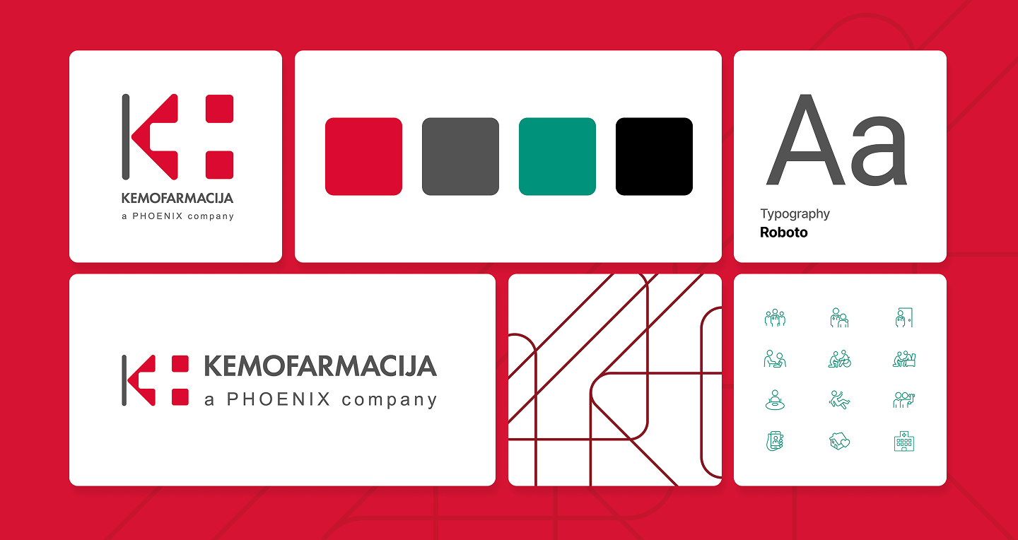
We developed a new corporate visual identity for Kemofarmacija that balances continuity and innovation. The focus of the redesign was the balance between the symbol and the logotype: the mark was refined to be more harmonious, clean-lined, and structurally modern, while the typography became clearer, more compact, and easier to read.
Elements of the Phoenix Group were incorporated into the new identity, a key strategic step. A distinctive dark green, characteristic of the group, was introduced, along with the typography used by the Phoenix Group, ensuring consistency across the corporate family. The result is an identity that communicates Kemofarmacija’s connection with Phoenix while retaining its own tradition and strong presence in the Slovenian market.
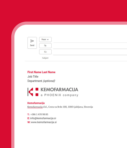
Beyond the core visual elements, we developed a comprehensive brand guidelines manual, which includes rules for logo usage, color palette, typographic system, and examples of primary and secondary applications. The new identity was rolled out across all key communication materials: from business stationery and internal documents to digital platforms, signage, and promotional assets.
The design is modular and flexible, allowing easy adaptation to different media while ensuring consistency and professionalism across all brand expressions.
The renewed identity brought Kemofarmacija greater clarity, cohesion, and recognition. The new look is balanced, modern, and aligned with the visual language of the Phoenix Group, reinforcing trust among partners and employees while clearly communicating the company’s strategic direction. In the Slovenian market, Kemofarmacija retains its independent identity and tradition, while visually reflecting its affiliation with an international group.
The new identity has become a powerful tool for brand building, effective communication, and long-term consistency across all channels—from corporate documentation to marketing campaigns. Today, Kemofarmacija presents itself with fresh energy and a clear message: we remain a market leader in Slovenia while being part of a major European family shaping the future of pharmaceutical distribution.
The website combines modern design and content structure, field-based data, and AI-powered support into a comprehensive information service for all park visitors.
The Soča Valley has launched the SočaBot AI assistant, helping website visitors explore and discover the destination more easily.
Your smart chatbot for everything you want to know about us or our work.
Start a conversation